Pages

Wednesday, April 30, 2014

Challenge #9 - Monochromatic Purple

Welcome to The Card Concept. 

This challenge we have a monochromatic colour theme for you to try! You must use the theme and create your card in one of the styles of the designers. 


The styles are explained HERE.


Clean & Simple


By only using two colors you can still do monochromatic but keep it CAS.


Clean & Graphic


Solid images and bold contrasts are staples of Clean & Graphic style!


Clean & Layering

Kay Miller


Purple? Did someone say purple? LOOOVE purple! I was inspired by the actual graphic design of the inspiration board!  Oh and the purple! :D


Shabby Chic

I was inspired this week by the beautiful flowers on the yummy cupcakes!


Freestyle Collage


Purple,my absolute favorite color! I really had to do some brainstorming on this one,since me as a patter paper addicted person,don't own any purple papers.So,i tried some inlay die cutting and i am pretty happy with how it turned out!

Classy & Elegant


When I think purple, I think little girls!  I used various shades of purple, embossing, flowers, a beautiful bow and the oh so elegant gold embossing on vellum for my card.


Our Rules
  1. Use the Challenge to create a card.
  2. Choose one of the design team "styles" to create your card. Click HERE for the different styles summary.
  3. Explain in your post which style you used.
  4. Link up your blog post here, not your whole blog.
  5. Comment on the card ahead of you and behind you in the linky. Everyone loves comments!

This challenge will end on Monday, May 12 at Noon (PST).


Challenge #8 - Winners

Hello Tracey here with the winner's for The Card Concept challenge #8!   Lots of April showers for this challenge so that can only mean lots of May flowers.   Congratulations to all of our participants for this week's challenge here at The Card Concept. We have each chosen a winner who we liked the best but not necessarily in our design style, and who followed the rules and challenge.

Challenge #9 goes live in one hour at 5:00 AM (PST).

If you are viewing this in Google Reader, please visit our blog, to see the winning projects, by clicking on the pictures.

Wednesday, April 23, 2014

Challenge #8 ~ Use an Umbrella ~ There's Still Time!

Welcome back to The Card Concept!

There is still plenty of time for you to play along with our current challenge  - to use an umbrella on your card. This challenge will end Monday, April 28th at noon (PST).

Have you checked out the gallery of entries so far? There are so many fabulous creations, our participants never disappoint!


Here is a reminder of our rules if you'd like to join in the fun:

1. Use the challenge to create a card

2. Choose one of the design team "styles" to create your card. Click HERE for a summary of the different styles.

3. Explain in your post which style you used. 

4. Link to your blog post for this challenge only, not your whole blog. 

5. Comment on the card ahead of you and behind you in the linky. Everyone loves comments!

Go HERE to link your creation!

Wednesday, April 16, 2014

Challenge #8 - Use an Umbrella

Welcome to The Card Concept. 

This week we have a theme for you to try! You must use the theme and create your card in one of the styles of the designers. 


Lee Ann is off this challenge, so Lesley is subbing in for her. 


The styles are explained HERE.


Clean & Simple


Paper Piecing can really make an image pop in CAS design.


You can still add a stamped pattern and keep it CAS.


Clean & Graphic

Ardyth Percy-Robb


A monochromatic colour scheme always feels clean!


Faux stitching 'plays nicely' with a clean & graphic card.


Clean & Layering


I had to go with a summer beach umbrella. I'm needing some sunshine and warmth here ;)

Kerin Sylvester


I was inspired to incorporate umbrella DSP, as well as make an umbrella of my own.


Shabby Chic


I didn't quite capture the many colours from the umbrellas in the inspiration pic, but I did manage to add an umbrella!

I was inspired to create a sweet little something full of layers, vintage lace, satin blooms and glittered raindrops for this week's challenge!


Freestyle Collage


My rain Umbrella needed a few puffy clouds and a few spots of rain......sunshine on its way.

Cindy Lovell 


I loved the idea,of letting little hearts rain, after I choose the sentiment for this card.


Classy & Elegant


Cathy Weber


How about an umbrella mobile for the elegant baby?

Lesley Croghan


I wanted to create an umbrella card that was all about being happy!

~ off this week ~
Our Rules
  1. Use the Challenge to create a card.
  2. Choose one of the design team "styles" to create your card. Click HERE for the different styles summary.
  3. Explain in your post which style you used.
  4. Link up your blog post here, not your whole blog.
  5. Comment on the card ahead of you and behind you in the linky. Everyone loves comments!

This challenge will end on Monday, April 28 at Noon (PST).


Challenge #7 - Winners

Winner Template

Hello Tracey here with the winner's for The Card Concept challenge #7!   What a beautiful collection of cards featuring butterflies.   Congratulations to all of our participants for this week's challenge here at The Card Concept. We have each chosen a winner who we liked the best but not necessarily in our design style, and who followed the rules and challenge.

Challenge #8 goes live in one hour at 5:00 AM (PST).

If you are viewing this in Google Reader, please visit our blog, to see the winning projects, by clicking on the pictures.


Wednesday, April 9, 2014

Challenge #7 ~ Use a Butterfly Theme ~ There's Still Time!

Welcome back to The Card Concept!

There is still plenty of time for you to play along with our current challenge  - to use a butterfly theme. This challenge will end Monday, April 14th at noon (PST).

Have you checked out the gallery of entries so far? If you're looking for some inspiration stop by, our participants never disappoint!


Here is a reminder of our rules if you'd like to join in the fun:

1. Use the challenge to create a card

2. Choose one of the design team "styles" to create your card. Click HERE for a summary of the different styles.

3. Explain in your post which style you used. 

4. Link to your blog post for this challenge only, not your whole blog. 

5. Comment on the card ahead of you and behind you in the linky. Everyone loves comments!

Go HERE to link your creation!

Wednesday, April 2, 2014

Challenge #7 - Use a Butterfly Theme

Welcome to The Card Concept. 

This week we have a theme for you to try! You must use the theme and create your card in one of the styles of the designers. 


The styles are explained HERE.


Clean & Simple

tracey_CC7

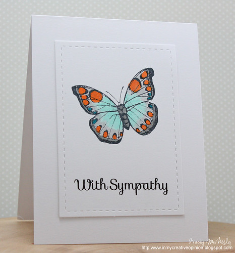
When using Copic markers create a separate panel so the recipient will not see the marker bleed on the inside.


Select a simple image and a large sentiment and you have the makings of a perfect CAS card.


Clean & Graphic


Match the feeling and weight of the lines in your font and image for a unified, clean feeling.


A layer of colored vellum can add softness to a clean & graphic card.

Clean & Layering


I just randomly cut some patterned papers on the diagonal and glued them down to create the background for this pretty butterfly.

Kerin Sylvester

I was inspired to use an assortment of butterflies to incorporate the theme, even a butterfly girl :)


Shabby Chic


I love the butterfly in the inspiration pic so I went about finding a similar one in my stamping supplies.  I think it's not a bad match (minus the blue tinge on it's wing!).


I found inspiration in the damask pattern on this pretty butterfly - I incorporated a black and vanilla color palette with a splash of pink and a pinch of elegant silver!


Freestyle Collage


My card doesn't deviate much from the inspiration because I loved the image and colours as they are.

Cindy Lovell 


I was drawn to these beautiful colors of the inspiration photo,so i mainly focused on them.And the dots on the butterfly,inspired me to create my dotted background!


Classy & Elegant


I used lots of layers, texture and shine to achieve an elegant look.


Cathy Weber


An elegant embossing folder adds interest without taking away from the butterfly focal point.


Our Rules
  1. Use the Challenge to create a card.
  2. Choose one of the design team "styles" to create your card. Click HERE for the different styles summary.
  3. Explain in your post which style you used.
  4. Link up your blog post here, not your whole blog.
  5. Comment on the card ahead of you and behind you in the linky. Everyone loves comments!
This challenge will end on Monday, April 14 at Noon (PST).