Pages

Wednesday, February 26, 2014

Floral Themed Challenge ~ There's Still Time!

Welcome back to The Card Concept!

There is still plenty of time for you to play along with our current challenge  - a floral theme! The challenge will end Monday, March 3rd at noon (PST).

The entries so far have been fabulous, so if you're looking for some inspiration check them out!


Here is a reminder of our rules if you'd like to join in the fun:

1. Use the challenge to create a card

2. Choose one of the design team "styles" to create your card. Click HERE for a summary of the different styles.

3. Explain in your post which style you used. 

4. Link to your blog post for this challenge only, not your whole blog. 

5. Comment on the card ahead of you and behind you in the linky. Everyone loves comments!

Go HERE to link your creation!


Wednesday, February 19, 2014

Challenge #4 - Use a Floral Theme

Welcome to The Card Concept. 

Before we get onto this week's challenge, the team and I want to let you know that we have been having difficulty commenting on both Stampin' Up blogs and blogs with Google+. If you have not heard from us, that is why! We feel badly about this and wish we could leave you some commenting love! We just wanted to let you know!

This week we have a theme for you to try! You must use the theme and create your card in one of the styles of the designers. 


The styles are explained HERE.


Clean & Simple

Tracey McNeely

tracey_CC4

I was inspired by the beautiful roses in the inspiration and the soft peach colour.


I was inspired by the big blooms and these beautiful colors.


I was completely inspired by the colors and all the different shades of pink/red.  

Clean & Graphic


To go clean and graphic, punch up the colours, simplify the shapes and use block (not script) text


A tidy font paired with simple embellishments (like 3 small seed pearls) will not compromise a clean & graphic design.


Clean & Layering


I was inspired by the beautiful springlike colors in the photo and of course the lovely flowers :)


I was inspired to use flowers and greenery in a vase, although I used different colors than pictured in the inspiration photo.


Shabby Chic

Narelle Farrugia 

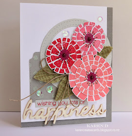
I was totally inspired by the flowers from the inspiration photo so I had a go at making them myself - they're kind of large, but I'm loving them.

I was inspired by the blooms from the vase - fully open, happy and so pretty!


Freestyle Collage


I imagined looking down on the vase, focusing on the rim, the flower layers and the grey/green foliage.


I started my card with the leaves,and from their i choose my flowers and colors,which of course i was inspired by the photo


Classy & Elegant


I added lots of layers, embossing, flourishes, timeless images and sparkle to create this elegant look.


Cathy Weber


An intricate die cut edge adds instant elegance.


Our Rules
  1. Use the Challenge to create a card.
  2. Choose one of the design team "styles" to create your card. Click HERE for the different styles summary.
  3. Explain in your post which style you used.
  4. Link up your blog post here, not your whole blog.
  5. Comment on the card ahead of you and behind you in the linky. Everyone loves comments!
This challenge will end on Monday,March 3 at Noon (PST).


Challenge #3 - Winner's

Hello, Tracey here with the winners from Challenge #3 - Use Monochromatic Pink.Once again the response to the challenge was overwhelming with 136 entries, the numbers just keep on growing. We hope that you are enjoying our challenges and will be back to play again this week for Challenge #4 which goes live in one hour at 5:00 AM (PST).

Congratulations to all of our participants for this week's challenge here at The Card Concept. We have each chosen a winner who we liked the best but not necessarily in our design style, and who followed the rules and challenge.

If you are viewing this in Google Reader, please visit our blog, to see the winning projects, by clicking on the pictures.


Wednesday, February 12, 2014

There is Still Time to Play in the Monochromatic Pink Challenge!

There is still time to join us for the current challenge, which is to create a project using Monochromatic Pink:


Check out the details HERE. The gallery is chock full of eye candy, and we'd love to see what you create too! 

This challenge will end Monday, February 17th at noon (PST). 


Wednesday, February 5, 2014

Challenge #3 - Use Monochromatic Pink

Meet Our Guest Designer for February 2014!


Hey everyone, Tracey here. Being a CAS designer I am always drawn to designs that have lots of white space, clean lines and boast simplicity. Clean and Simple cards are not easy to create. They take a strong design sense to make a bold statement without clutter and bulk. Today I am so excited to introduce our February CAS Guest Designer who has that strong design sense that makes her cards so captivating. Please welcome Laurie Willison as our CAS Guest Designer for February!


Hello!  My name is Laurie Willison and I am a mom of 2 from Kansas.  I am an party time RN and part time SAHM and a full time crafter!  :)  I have started scrapbooking back in 1998 and then was introduced to stamping in 2007....and I have been hooked every since.  My style is pretty much CAS.  I love white space and find myself using white card bases a lot, with a pop of color here and there.  You can find me over on my blog, Soapbox Creations.  A big thank you to Tracey for the invitation to spend the month of February with this amazingly talented group of ladies!  

_______________________________

This week we have some colours for you to try! You must use the colours and create your card in one of the styles of the designers. 

The styles are explained HERE.


Clean & Simple

Tracey McNeely 


I used the soft pinks and white sequins as a background so the solid heart could take centre stage.


By keeping my balloons to one side this kept my card CAS.

Laurie Willison (Guest Designer)


I focused on all the shades of pink in the photo.  I love the flowers and how they range in all shades of pink.


Clean & Graphic


I focused on one item (the ribbon) and repeated it to keep this graphic card clean.


My card was inspired by the gorgeous flowers in the vase and how beautifully the petals 'nested' together.


Clean & Layering


I was inspired by the beautiful vase of pink flowers. If you're going monochromatic, it should be pink right ? ;)


I was inspired to use the floral DSP by the pretty pink flowers in the vase of the inspiration photo.


Shabby Chic

Narelle Farrugia 


The inspiration for my card from the vase of pink roses in the inspiration picture as well as a smidge of green from the background.


 I {heart} PINK!  I was inspired by the lovely flowers, ribbon, mixy matchy collectables in the hutch and beautiful antique chair!


Freestyle Collage

Karen Davis 


Pink and this cute Chickadee stamp, I thought they were a perfect match.


I was inspired by the papers i choose.After i saw these little cute elephants,i knew i wanted to use this adorable elephant die...of course in pink! :) And since this is reather a card for a little one,i will give this to my 9 year old on Valentines day!

Classy & Elegant


I focused on the overall soft feeling I got from the photo.  I used embossing, a die cut flourish, a sparkly button and I framed my image for an elegant look.


Nothing says elegant like pearls, lace and a swirly sentiment.


Our Rules
  1. Use the Challenge to create a card.
  2. Choose one of the design team "styles" to create your card. Click HERE for the different styles summary.
  3. Explain in your post which style you used.
  4. Link up your blog post here, not your whole blog.
  5. Comment on the card ahead of you and behind you in the linky. Everyone loves comments!
This challenge will end on Monday, February 17th at Noon (PST).

Challenge #2 - Winners

Hello, Tracey here with the winners from Challenge #2 - Using Texture.  Once again the response to the challenge was overwhelming with 119 entries for the second challenge.  We hope that you are enjoying our challenges and will be back to play again this week for Challenge #3 which goes live in one hour at 5:00 AM (PST).

Congratulations to all of our participants for this week's challenge here at The Card Concept. We have each chosen a winner who we liked the best but not necessarily in our design style, and who followed the rules and challenge.

If you are viewing this in Google Reader, please visit our blog, to see the winning projects, by clicking on the pictures.